


An ios app that reduces friction when planning a backpacking trip to a national park.

Client
Spencer Thompson
Duration
2-Week Design Sprint
Roles
Researcher, UX/UI Design
Figma - Google Forms - Optimal Workshop - Maze - Adobe Illustrator - WCAG
Tools
Overview
The Problem

Planning a backpacking trip to a national park and securing the proper passes and permits can be confusing. Trip planners often visit multiple sites to obtain reliable information, reviews, park wayfinding, trail maps, and local attractions plus much more.
A related problem is that once the recreational passes and permits are secured they are difficult to access in remote offline situations.

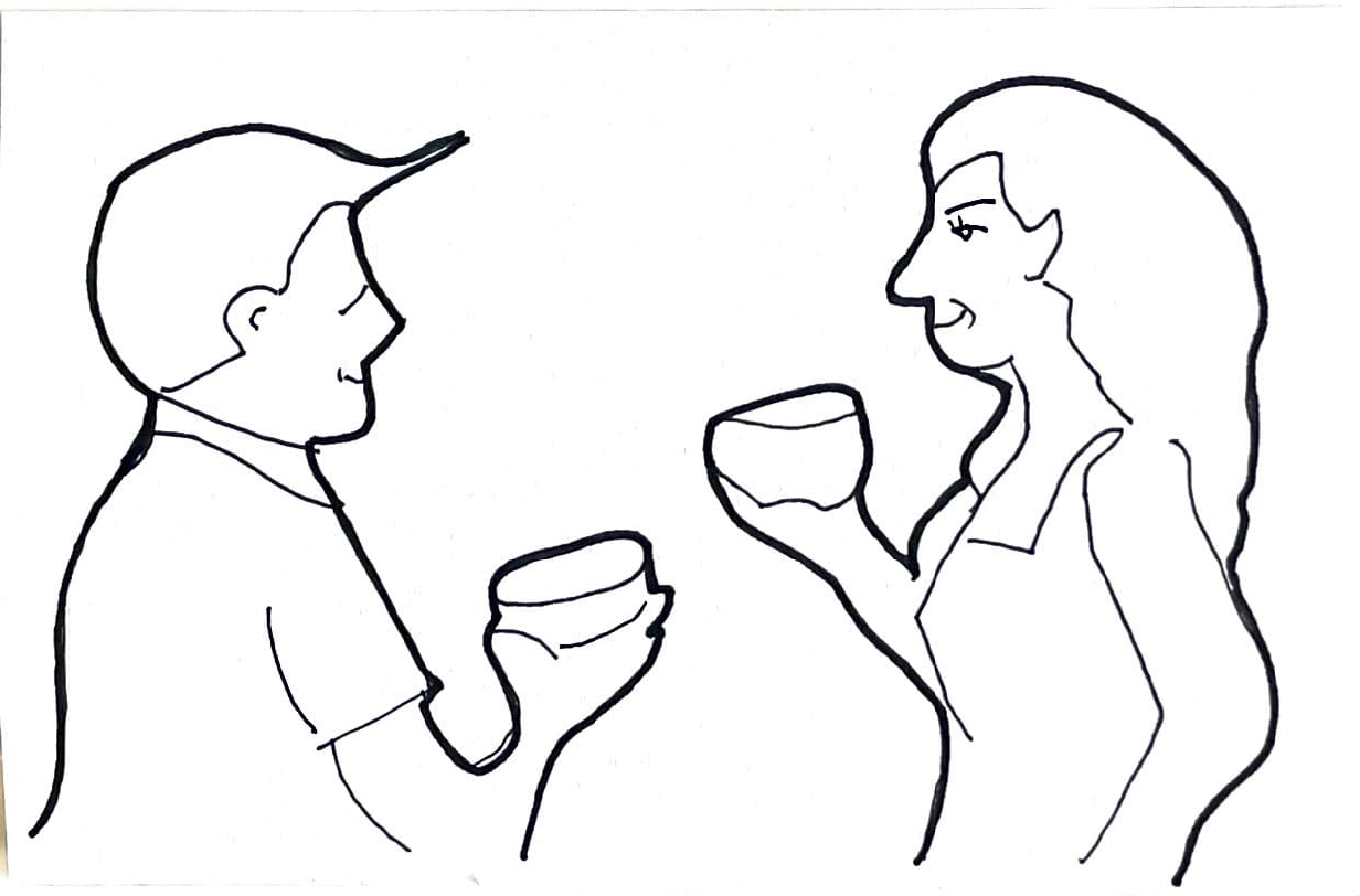
Wayfinding with my client
Passes & Permits
Offline Access
Trip Planning
Recreational passes and permits need to be easy to understand and secure for an upcoming trip.
Recreational passes and permits must be easy to access and present to park rangers even when cell service is unavailable.
The trip planning to a national park needs to be time efficient and leave the backpacker feeling confident about their upcoming trip.
How Might We…
The How Might We exercise finds the possibilities in a problem. The question frames the challenge in a way that promotes an empathetic approach. This connects to the user’s needs in a more meaningful way.
Design an app that helps users secure digital recreational passes and permits and store them within the app wallet for offline use. Take the confusion out of what passes and permits are needed per recreation. Make planning a trip to a national park an easy experience with an app that is clean and simple to use.
Pick a target - MVP

Discovery & User Research

User Survey
To find survey participants for the topic of backpacking I joined various online forums and Facebook groups dedicated to the subject. I also joined various National Parks forums. This survey had 28 respondents.
68% of survey respondents rely on reviews when planning a trip to the national parks.
48% of survey respondents are frustrated by the recreation pass or permit process.
76% of survey respondents go online and plan their national park visit before they make the trip.
I interviewed 5 survey respondents.
I found similar experiences of frustration with the national parks website and the trip planning process as a whole. Interestingly, some people avoided going to a national park because of the ordeal of finding the right permits or park wayfinding once they got to the park.
User Interviews
“It usually takes me a number of days to plan a backpacking trip because I am jumping from site to site.”
Kate - 33
“I get confused about where to go when I enter the park. It’s sometimes difficult to find trailheads once you’re in the park.”
Jared - 47
“There have been times where I didn’t have cell service and I couldn’t access my email that had the permits I purchased.”
Talbot - 25
The competitive marketplace showed just how disparate the national park trip planning processes are and how one might be forced to engage with multiple sources to be fully prepared for an upcoming trip.
Competitive Analysis

NPS
No reviews
Lack of good photos
Shows fees to enter the park
Tells if reservations are needed for hike

National Parks
Nice park overview
Tour Schedule
No way to purchase a pass or permit
Talks about other activities but executed poorly

The Outbound
Not a lot of reviews
Not a lot of photos
No information if permits are needed or not
Tells what to expect on a hike, i.e. waterfalls, rivers, etc
Empathy Mapping
I developed a persona to magnify the user throughout the design process. An empathy map began to unearth user-centered insights from my research.

A journey map gave me a more focused target audience as I began to ideate solutions.
Journey Map

The Four Step Sketch

Notes & Ideas
Crazy 8’s
I started roughing out targeted possibilities with notes & ideas. The thinking was to join trip planning with a digital wallet that allowed offline access to park passes and permits.
A rapid ideation method that allowed me to plot out the course of the product with the MVP in mind.

Solution Sketch
Through sketching the solution was starting to take shape. The aim was to narrow in on a single concept.

Validating the Solution
I put the solution sketch in front of users who had experience with national parks and had them critique the main concept. I made 3 changes based on the suggestions of users.
I moved the search bar above the list of national parks. This was recommended because the users wanted the parks closer to the corresponding trails.
I paired down the details for a hike to only pertinent information and grouped them together by similarity.
I added an expired permit feature because these permits have varying shelf lives.


Sierra loves visiting the national parks but planning her trip has her jumping from website to website, gathering information, reading reviews, and purchasing park passes and permits.
After she purchases her recreational passes and overnight permits she prints them so she can show the park ranger if she is out of cell phone range.
While at a party, a friend tells her about an app that helps with national park trip planning. The app has park information, user reviews, AND you can purchase and store all the park passes and permits in the digital wallet.
Sierra downloads the app and is surprised by how easy it is to plan her trip to a national park. No more confusion. No more jumping from site to site.
She purchases all of her recreational passes and backpacking permits all within the app.
When Sierra arrives at the national park she loses cell service because of the remote location but all of her purchased passes are stored offline in her digital parks wallet. She shows the park ranger her information and is on her way.
Storyboard
I created a storyboard to visualize the pain points before using the product and to prove the ease of use afterward.

User Stories / Flows
High-priority user stories informed 3 flows that bring national park planning into one simple holistic experience and funnel the user to purchasing a park pass or permit depending on their recreation.
PRIORITY 01
As a user, I want to have access to maps, passes, and permits offline, so that I can use them in remote areas.
PRIORITY 02
As a user, I want to have understandable park information, so that I can plan my national park visit with ease.
PRIORITY 03
As a user, I want to read other travelers’ reviews about park attractions, so that I can make an informed decision about what to do while I am there.

Rapid Prototyping
I am a visual and tactile learner. I needed to get my hands to work by building a paper prototype to validate my user stories. This would prove my mental model and serve as a template moving forward. I started with a super rough paper prototype and then refined it from there.
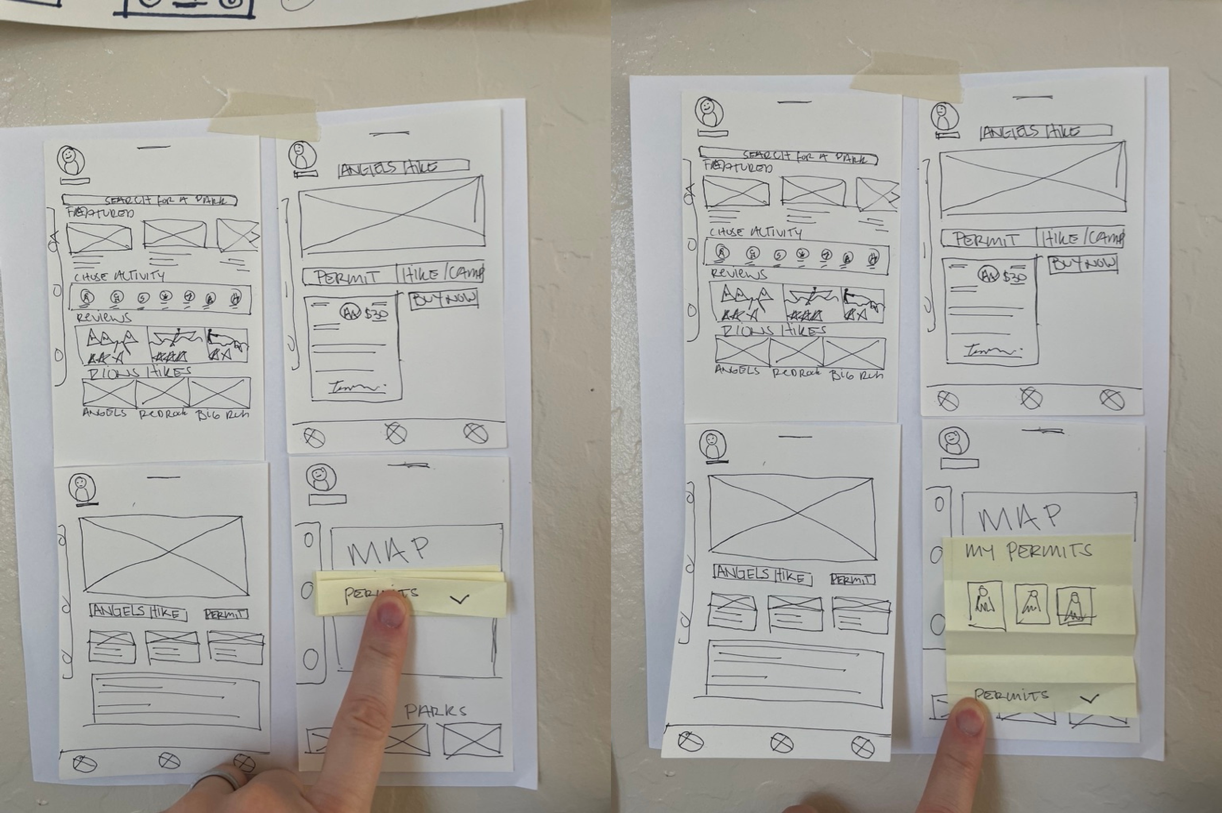


Wireframes
User Flow #1 [First Iteration]


User Flow #1 [Second Iteration]

Usability Testing

Unmoderated Usability Testing with Maze
I created an unmoderated usability test in Maze and got feedback from 8 participants.
100% of participants were easily able to perform the task, “Find Angels’ Landing and select it”.
89% of participants felt the task “Select the date that you want to go hiking” was straightforward.
100% of participants had direct success with the task, “Reserve your permit and pay for it” was simple but 23% missed the secondary task to download a map with the purchase.


User feedback led me to make a few changes.
I called out the download a map button with bolder text.
I enlarged the number one that appears after the purchase of a permit to call more attention to the profile.
I fixed the selected state on the calendar (it was not working properly during the first round of testing).
Task #1
Find Angels Landing and select it.
Task #2
Select the date you want to go hiking. (July 16th)


“It seemed pretty straightforward. It worked as expected.”
“I had to tap a couple of times to make sure I selected the date. I didn’t see the date change at the bottom until later.”
Task # 3
Task #4


Reserve your permit and pay for it.
Find your newly purchased permit.
Be sure to download your trail map for offline use before checking out.
Find the permit in your digital wallet and magnify the QR code.
“I honestly didn’t even see the download a map with purchase button.”
“I tried multiple times to magnify the QR code but it didn’t want to work for me.”


User Feedback
Style Guide
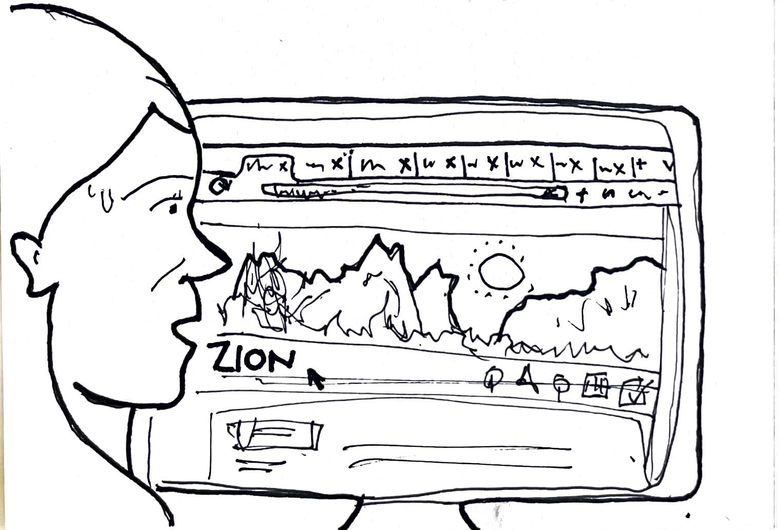
My client chose orange to be the pop of color for CTA treatment and various interactions. This decision would differentiate the product from the green that many companies in the space are using. Together with a dark brown, I came up with the “Rock & Fire” style. This is a nod to the Zion National Park that was researched and worked with throughout the project.
MVP


What I learned
It was really interesting to watch the paper prototype being tested. The users quickly understood the mechanics which meant that my mental model was good. This was very satisfying to see.
My client loved the paper prototype. He said that really started catching the vision once he was able to see how things worked.
There were some things that I definitely need to clarify in the low-fidelity prototype. I needed to shave the time it takes to do certain tasks. There were also some hierarchical issues that prevented quicker responses.
It was fun taking all the blue-sky ideas from the client and reigning in those concepts into one simple MVP.